YOUR BUSINESS AUTHORITY
Springfield, MO
YOUR BUSINESS AUTHORITY
Springfield, MO


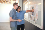
Stepping into the downtown office of branding agency Longitude LLC for an Aug. 28 design presentation meeting, Springfield Diner owner Omer Onder had no idea what to expect.
And that’s exactly how he wanted it.
“I wasn’t picturing anything. I didn’t want to picture something,” Onder said during the meeting to reveal logos, signage, apparel and other visual elements to potentially be used in his diner rebrand.
He thought picturing something in advance would keep him from having an open mind to the visual designs offered by agency co-owners Dustin Myers and Jeremy Wells.
“I knew you guys are going to do the right thing and the best thing,” Onder said, adding he was impressed with what he saw at the meeting.
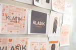
Rather than throw a multitude of options at Onder, Myers said the intent was to hone in on a single path. A design direction meeting held in late July laid the groundwork after Onder selected Klasik Diner as the restaurant’s new name.
“The design meeting that we went through with him reduces the amount of directions that we could go,” Myers said. “Without going through that process, there’s a million different ways.”
Using the restaurant’s positioning statement of “Turkish-inspired classic diner” as a guide, Longitude created a single package of visuals for Onder to review. Myers said the main logo pulls inspiration from old American diners. He and Wells noted usage of the sign in neon, a classic look, would be eye-catching. The color scheme of the logos, fonts and signage are mostly black and white, along with orange already in use at the diner. Myers noted most diners had a simpler color palette because they couldn’t afford multiple options.
“It has that bold, vintage and authentic feel to it,” Myers said. “We’re trying to capture an old-time diner with a fresh and modern approach, as well as bringing in the Turkish side.”
Onder recognized those challenges.
“There is no other kind of restaurant like this,” he said. “I know it’s hard for you guys.”
Onder broke into laughter upon noticing Myers and Wells even included a logo of him – complete with chef’s hat and mustache – into the marketing materials. He originally overlooked the image after thinking it was shaped like a slice of toast.
The designs also incorporate the phrases “warm smiles,” “good times,” “made with love” and “authentic dishes” to enhance the diner’s concept.
Following a process
The creative effort began a couple weeks’ prior, when Myers took to doodling on a sheet of paper for inspiration. It’s a typical part of his design process.
Also incorporating sketches on an iPad, he said the process takes about a week. The design meeting with clients narrows down the wide range of options. He’s utilized the one-concept approach for about four years, adding Wells started doing so even earlier.
“How I used to do it was explore every possible idea and then come up with three concepts, three potential directions for them to go in,” Myers said. “There’s a lot of bad things about that. One, you end up spreading out the good ideas among three different concepts. Then a lot of times the client will want one piece from this one and one piece from that one and try to Frankenstein something together that just doesn’t end up turning out as well.”
He and Wells rationalize that if proper research is done before the design presentation, three totally different ideas shouldn’t emerge.
“They’re hiring us to solve a business problem,” Wells said. “You’re not solving a problem for them if you’re providing them with a handful of ways that are all widely different. You need to hone in on what’s going to be in your mind the best course to take.”
In the sketch phase, Myers said they might come up with 20-50 sketches, with a similar amount of potential solutions when following it up in the digital phase.
“A lot of it is like taste-testing different colors and fonts – how they can work together, what will be the dominant font, what will be more secondary stuff,” he said. “It’s a lot of intuitive decision making.”
All the subtleties in design – serif, narrow or wide fonts, say – communicate different feelings and emotions.
“It’s kind of just trusting the process,” Wells said.
On the agenda
Immediately following the presentation, Onder said he liked everything in the design package.
Wells said a follow-up meeting at the diner is next on the agenda. It will help determine ideas and application of where and how some of the design elements will be incorporated. It might include determining if, and for how long, Onder would need to temporarily close to tackle diner renovations for new signage, furniture and paint.
With so many details to monitor, Myers and Wells say the agency is willing to help with signage estimates or connecting Onder with their contacts.
“Sometimes restaurant owners get a little overwhelmed at this point, so anything we can do to help, we will,” Myers said.


A franchise store of a Branson West-based quilting business made its Queen City debut; Grateful Vase launched in Lebanon; and Branson entertainment venue The Social Birdy had its grand opening.
$2M in tax credits awarded to SWMO nonprofits
Baldwin, Lathan to chair United Way campaign
Produce recall impacts food sold at Walmart, Aldi and Kroger
Mixed-used development proposed in KC area
Tax deduction program for farmers set to launch
Report: Panera explores sale of Caribou Coffee, Einstein Bros Bagels

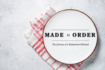 Made to Order: The Journey of a Restaurant Rebrand