I’ve been waiting for this day.
Springfield has a new flag. It’s not just a nylon flag that’s excitable. It’s the design, the symbolism and the potential to unlock civic pride like never before.
Over a year ago, I wrote a column challenging designers to improve the status of our city flag. The current flag was adopted in 1938 and its design is mediocre at best, based on proven design standards. The worst thing is it’s unremarkable. Without Googling it, can you visualize the official flag of Springfield? Although if you do a Google search by image, the results say the best guess is a “confederate flag license plate.” Try it.
The issue is there’s nothing uniquely connective to our city – unless you count the design-taboo lettering, “Springfield, Missouri,” smack dab in the middle.
We can do better. So, in December 2015, I called on our city’s talented designers to create a new look.
Well, last week, a new-look flag appeared on the conference table at Springfield Business Journal. It was carried in by John McQueary, aka co-owner of Hotel Vandivort, who had with him colleagues Sean Brownfield, Joel Thomas and Jeff Houghton.
Truth is the newly designed flag had nothing to do with my column. It appears we were separate thoughts on the same trajectory.
They say it all started in May 2016. On a weekday morning, McQueary decidedly took 30 minutes to disconnect from the hotel happenings and sat with a cup of joe outside of The Coffee Ethic. About 30 feet above him was the humdrum flag, gently waving. He noticed it. That was all it took.
“I had just watched a Ted Talk about it – the one you saw,” he tells me. “That was the spark.”
This is the story of how it came to be.
It was happenstance, the organizers say. While McQueary’s idea was percolating, Brownfield and Houghton separately came along that morning. Almost in unison, they thought: Geez, we should do that.
“Shortly after that we created our secret discussion group online,” McQueary says.
Joel Thomas, a local architect, also was in on the early Coffee Ethic talks.
The four created the Springfield Identity Project.
“There’s a bit of an identity crisis being a city named Springfield,” McQueary says. “That just means generic city, and we feel we’re anything but that.”
The visual journey was next.
The secret society started meeting weekly in May to formalize what a new flag might look like.
They went to the 365-member Springfield Creatives to solicit designs, and over 20 members signed nondisclosure agreements to join the process.
“That was the challenge. We heard stories where processes like this never get off the ground if it’s public from the start,” McQueary says. “We had to keep it quiet but put our fingers out in the community.”
Not all of the interested designers submitted concepts, and it came down to three finalists. But ultimately the creation of an anonymous committee member was selected.
Symbolism was key from the start, and the designs had to answer: What makes Springfield unique? And it had to be in a timeless manner representative of the whole community.
“It’s a heavy thing to come up with a flag design,” Houghton says, emphasizing the five “guardrails” taught in the influential TED Talk by Roman Mars.
A 10-person committee was created to guide the process. Members added were Kirk Banasik of Noble Communications, graphic designer Gary Bedell, Michelle Billionis of Coffee Ethic, photographer Julie Blackmon, writer/editor Kelly Knauer and retired Marlin executive Michael Stelzer.
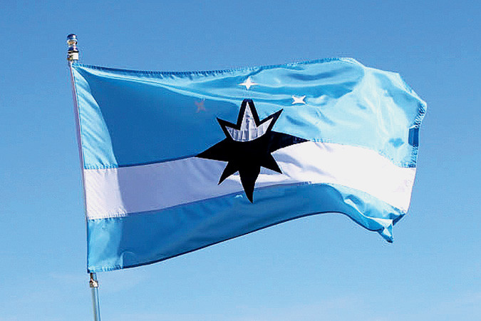
In the end, elements of other flags that didn’t make the cut were specific historical events, such as Wild Bill Hickok’s shootout on the square and the “Ozark Jubilee” television show. The committee knew defining factors were as the crossroads of the nation and the Queen City moniker. Both of those elements are symbolized in a “compass crown” at the center of the new flag’s design.
Other identity pieces are the white stripe, symbolizing the founding of Route 66 and the city’s geographic position on a plateau, as well as three stars representing innovative spirit, connection with nature and the Ozarks’ culture.
Like the design or not, city residents have something solid to consider. It’s far from official; that takes City Council approval.
Sure, there are more important things for a city to focus on. Just last week Police Chief Paul Williams told Springfield News-Leader the department would form a vice unit to look closer at human trafficking in our city.
“I agree,” McQueary says to such criticism. “Now, we have a banner to rally under.”
These flag efforts don’t take away from the work in crime prevention, economic development, poverty correction and workforce training. They all work together to create a fabric we choose to weave.
As McQueary tucked the folded flag under his arm and walked out of our office, I couldn’t help but notice a look of pride on his face and a confidence in his step.
That’s what a well-designed flag can do. For an entire city.
Springfield Business Journal Editor Eric Olson can be reached at eolson@sbj.net.