YOUR BUSINESS AUTHORITY
Springfield, MO
YOUR BUSINESS AUTHORITY
Springfield, MO
This poll is not a scientific sampling. It offers a snapshot of what readers are thinking.


Shawnee gunpowder company announces acquisition
Curb Appeal: April brings $19M in high-end home listings
Springfield Trading Co. set to open hot sauce shop
Buc-ee’s plans store in Kansas City area
STL public company to go private in $3B deal
Lake of the Ozarks casino supporters submit 320K signatures for ballot
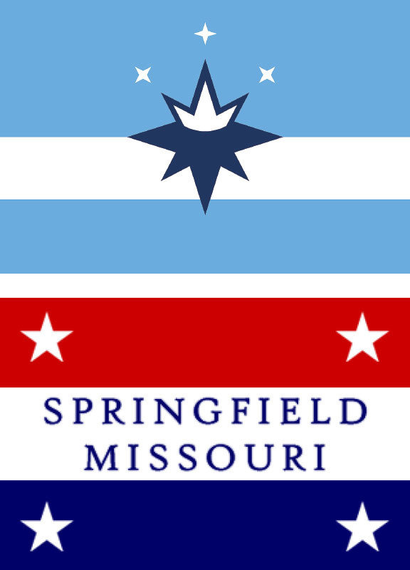

Your choices do not match the layout of the flags. This design flaw in your poll is minor but has huge impacts in how people perceive their answers. This flaw invalidates your results.
I don't have a problem with the new flag design... except that the color scheme is pretty boring. "Powder Blue" does not say "SPRINGFIELD, MISSOURI" to me. If they just kept the color scheme of the ORIGINAL flag with the design pattern of the new flag, it wouldn't be half bad.
I prefer the new flag to the old one, and I doubt I could design a better one. That said, it's still a little...boring. Less boring than the old flag but still somehow lacking the elements of nature that are the one thing that help Springfield stand out. Some green maybe, and maybe a different shade of blue. That blue is so...bland.
I am tired of people tearing down tradition. The “old” flag is our history! Keep it!